Custom Appearance (Theme, Custom Color Palette, Font Pairing, Wallpaper)
The Custom Appearance section gives full control over your page’s visual style.
While default themes provide a great starting point, Custom Appearance lets you modify every visual component — from colors and fonts to backgrounds and button styles.
Theme
Purpose
Themes define the overall structure and base styling of your Link Page, including button shapes, spacing, and text hierarchy.
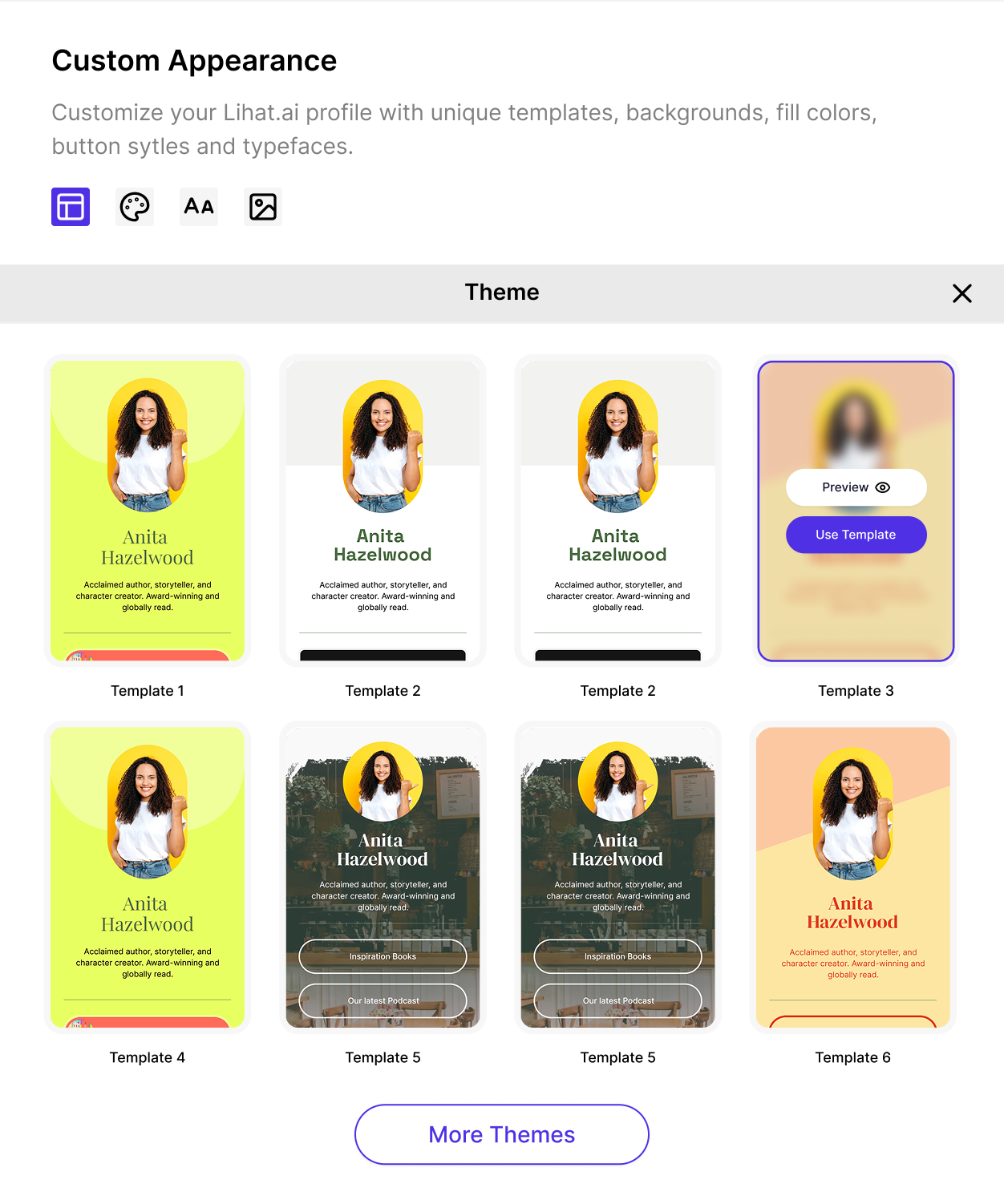
Steps
- Go to the Theme dropdown in the Custom Appearance section.
- Choose a base theme layout that fits your brand aesthetic.
- Each theme automatically applies a default font pairing and color palette — you can override these later.
Tips
- Use a Minimal Theme for professional or corporate brands.
- Choose a Playful Theme if your audience is creative or youthful.
- Preview before applying to ensure button contrast remains readable.
Custom Color Palette
Purpose
Your color palette defines the mood and brand impression of your Link Page.
Lihat.AI allows both preset and manual color customization for total flexibility.
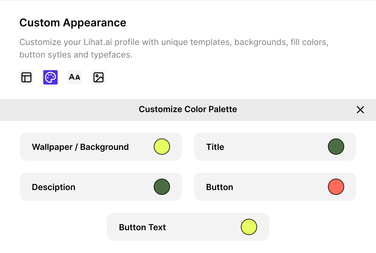
Editable Color Variables
You can adjust:
- Primary Color — used for main buttons and call-to-action elements.
- Secondary Color — used for links, highlights, and secondary buttons.
- Text Color — controls all text color across headings and body text.
- Background Color — defines the page background.
- Accent Color (optional) — used for hover effects, borders, or icons.
Steps
- Open Custom Color Palette.
- Click each color box to open the color picker.
- Choose from presets or enter your custom HEX or RGB code.
- Save changes and preview instantly.
Tips
- Maintain high contrast between text and background for readability.
- Use your brand’s color codes for consistency across platforms.
- Keep the number of primary colors between 2–3 to avoid visual clutter.
Font Pairing
Purpose
Typography defines your brand voice and affects how users perceive your page.
Lihat.AI offers curated font pairings optimized for legibility and aesthetics.
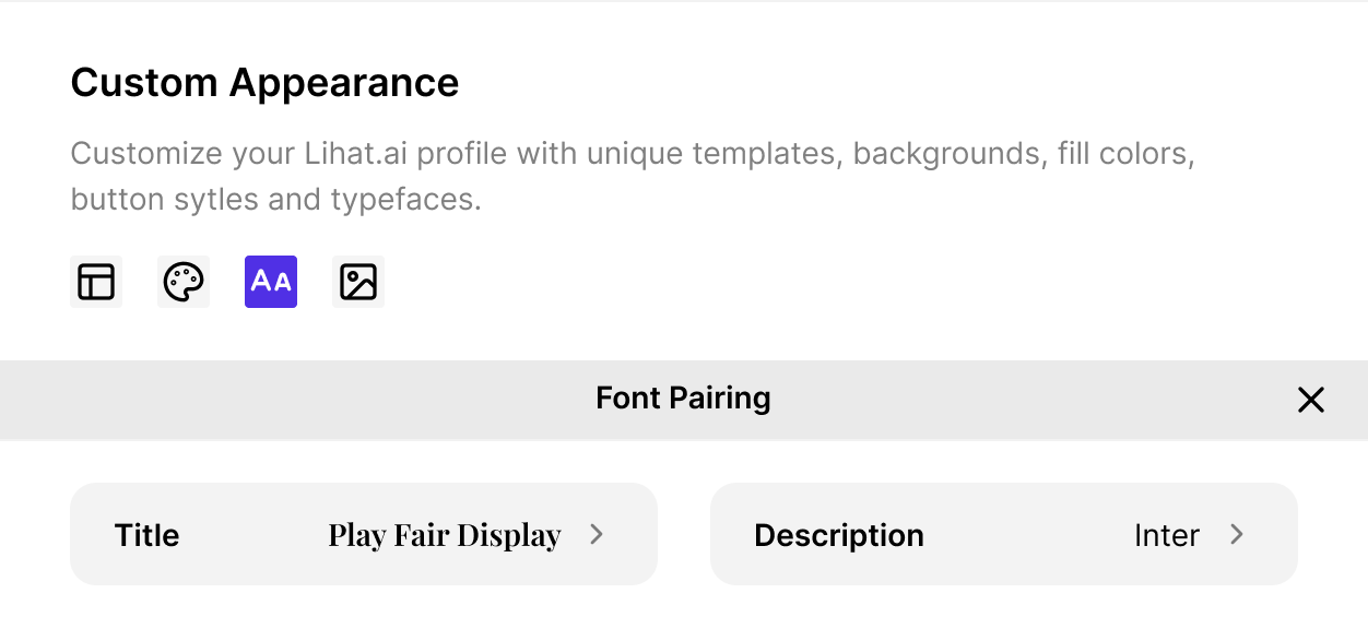
Editable Options
- Heading Font — used for titles and button labels.
- Body Font — used for descriptions and paragraphs.
- Font Weight — control how bold or light your text appears.
- Font Size — adjust text hierarchy for readability.
- Letter Spacing & Line Height (optional) — fine-tune text rhythm.
Steps
- Open the Font Pairing tab.
- Select a preset combination or choose individual fonts manually.
- Preview both desktop and mobile views to check text balance.
- Save your settings.
Tips
- Use one sans-serif + one serif font for natural contrast.
- Ensure button text remains large and legible on mobile.
- Keep consistent font weights across sections.
Wallpaper / Background
Purpose
The wallpaper or background defines the tone of your page and adds personality.
You can upload a custom image, choose a gradient, or use solid colors.
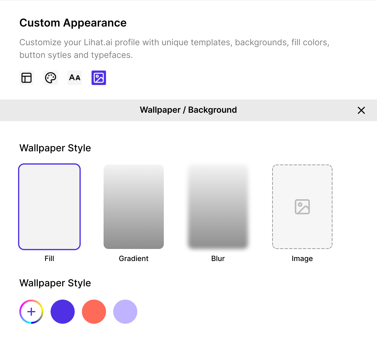
Options Available
- Solid Color Background
- Choose any flat color to keep your design simple and clean.
- Works best for corporate or minimal brands.
- Gradient Background
- Combine two colors for a subtle and modern effect.
- Example: Linear gradient from pastel pink to soft purple.
- Image Background (Wallpaper)
- Upload a custom image (JPG/PNG).
- Use brand imagery, textures, or abstract shapes for depth.
Steps
- Go to the Wallpaper section.
- Click Upload Image or choose Solid/Gradient.
- Adjust:
- Brightness / Overlay – to keep text readable.
- Blur or Transparency (if available) – for better contrast.
- Click Preview to test readability.
Best Practices
- Image dimensions: at least 1024×768 px for optimal clarity.
- Keep file size under 1MB for fast loading.
- Avoid busy or dark backgrounds behind text-heavy sections.
- Add a semi-transparent overlay to improve contrast.